UI Motion Design Best Practices for Product Apps

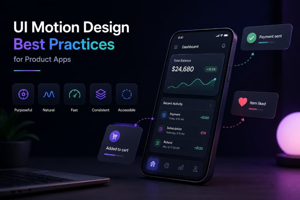
How purposeful transitions communicate hierarchy and state — without slowing perceived performance on mobile networks.
Motion should explain, not decorate
Purposeful motion answers questions: where did this panel come from, what changed after my click, is the system busy or done? Decoration that do not communicate state become latency wearing a costume.
We budget motion like we budget bytes. Every transition needs a job, a duration range, and a reduced-motion alternative.
Review motion on the same devices and network profiles your customers use. An animation that feels polished on a design laptop can feel like lag on mid-tier Android under spotty connectivity.
Hierarchy through choreography
Staggered entrances can guide the eye to primary actions without shouting with colour. Shared element transitions help users keep context across navigations.
Keep easing consistent across the product. A library of two or three curves beats a new cubic-bezier per screen.
Review motion on the same devices and network profiles your customers use. An animation that feels polished on a design laptop can feel like lag on mid-tier Android under spotty connectivity.
Performance and mobile networks
Prefer transform and opacity. Avoid layout thrash during animation. On low-end devices, shorten or drop non-essential motion automatically.
Perceived performance improves when skeleton states and optimistic transitions bridge waiting time — but never block input on ornamental effects.
Review motion on the same devices and network profiles your customers use. An animation that feels polished on a design laptop can feel like lag on mid-tier Android under spotty connectivity.
Implementation discipline
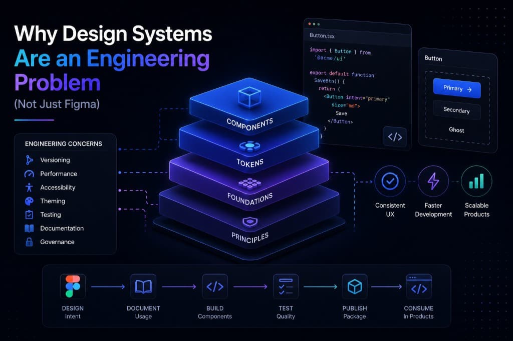
Design tokens for duration and easing keep engineering and design aligned. Document which components own which transitions so product teams do not reinvent them.
Motion reviews belong in QA for critical flows. If an animation confuses a first-time user in testing, it is not ready — no matter how polished it looks in a demo reel.
Review motion on the same devices and network profiles your customers use. An animation that feels polished on a design laptop can feel like lag on mid-tier Android under spotty connectivity.
Budget motion like bytes
Every transition needs a job, a duration token, and a reduced-motion alternative. Prefer transform and opacity; drop non-essential motion on low-end devices.
Purposeful UI motion clarifies state — decorative motion is just latency wearing a costume.
Review motion on the same devices and network profiles your customers use. An animation that feels polished on a design laptop can feel like lag on mid-tier Android under spotty connectivity.
Choreograph hierarchy, not decoration
Staggered entrances can guide the eye to primary actions. Shared element transitions help users keep context across navigations.
Keep two or three easing curves across the product. A new cubic-bezier per screen is noise.
Review motion on the same devices and network profiles your customers use. An animation that feels polished on a design laptop can feel like lag on mid-tier Android under spotty connectivity.
Respect reduced motion and low-end devices
Prefer transform and opacity. Avoid layout thrash during animation. Shorten or drop non-essential motion automatically when appropriate.
Skeleton states and optimistic transitions can bridge waiting time — but never block input on ornamental effects.
Review motion on the same devices and network profiles your customers use. An animation that feels polished on a design laptop can feel like lag on mid-tier Android under spotty connectivity.
“Sustainable delivery comes from making the important trade-offs explicit, measurable, and recoverable.”
Checklist
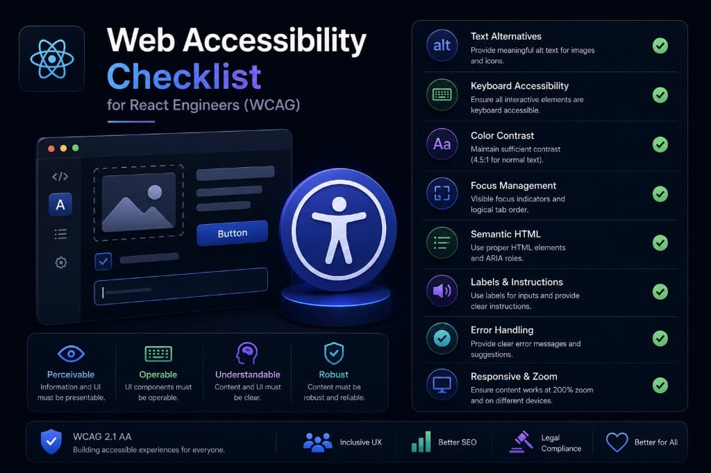
- Semantic structure and keyboard path reviewed
- Focus, error, loading, and empty states designed
- Contrast and accessible names tested
- Responsive and reduced-motion behavior specified
- Reusable component usage documented
- Real-device acceptance checks completed
Umar Khalid
Software Engineering Manager
Manages day-to-day software engineering across APIs, web UI, and AI features — focused on reliable, maintainable production systems clients can own.
Let's build something
remarkable
Whether you need a web or mobile app with AI integrations, blockchain work, or a conversation about our AI products — tell us what you're building and we'll respond fast.
Blog questions
How we write, how often we publish, and how you can contribute or stay in the loop.
Blogs are written by Automative Tech’s engineering leadership — Muhammad Talha Zubair, Bilal Hassan, and Umar Khalid — based on production web, mobile, AI integration, and blockchain work.
We lead with custom web and mobile delivery with AI integrations — Next.js, React, React Native, Flutter, and LLM features. Selected posts also cover blockchain, AI products, and cloud when they support shipping real products.
A few deep pieces per month. We prioritize substance over cadence.
Yes with attribution and a link back to the original. For syndication, contact us for a simple agreement.
Occasionally, when the author has real production experience. Pitch a short outline via the contact form.
Follow the social links in the footer, or contact us to ask about engineering notes updates.